
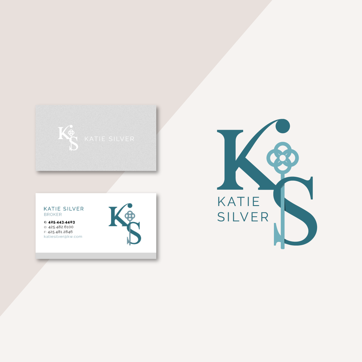
A real estate broker was looking for a monogram style logo that was feminine, professional and modern. She wanted to incorporate imagery of a key or door. The logo would be used across a variety of print and digital applications.
RATIONALE:
This design provides a modern, feminine take on the classic monogram. The heavy serif gives the lettering more weight and stability, setting a professional tone. The detailing on the K prevents the lettering from leaning too corporate and stodgy.
The imagery of a key is fully integrated into the S to make the key an intentional part of the design.